Checkout the Crossmint Playground to play with a live demo and
theming options!
uiConfig object to the CrossmintPaymentElement:
hideCardForm to true.
Themes
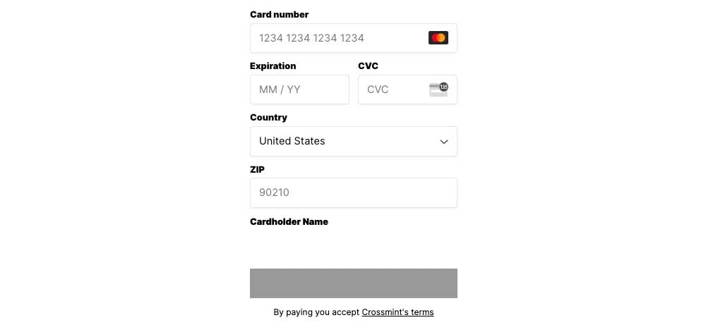
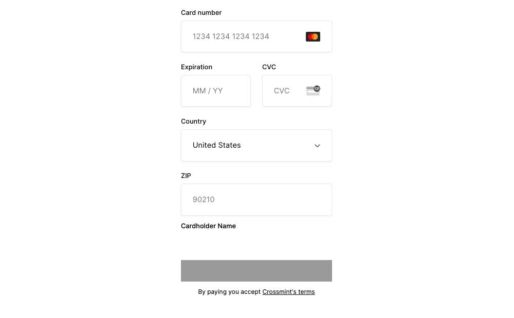
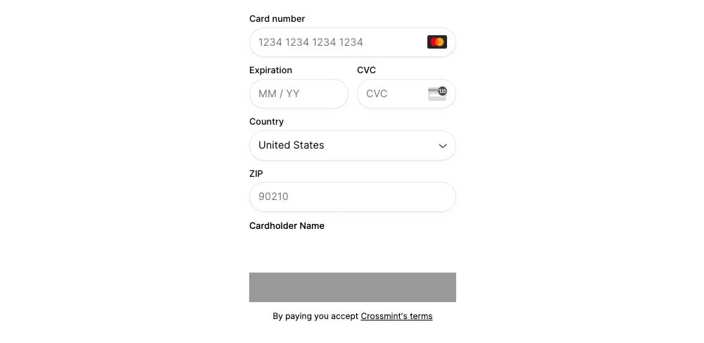
Explore the following templates:- Minty Light
- Minty Dark
- Solarized Light
- Solarized Dark
- Material Light
- Material Dark
uiConfig |  |
Property Reference
Background Color
background
background
Sets the background color of the checkout element.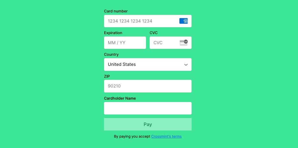
backgroundSecondary
backgroundSecondary
Sets the background color of the input fields.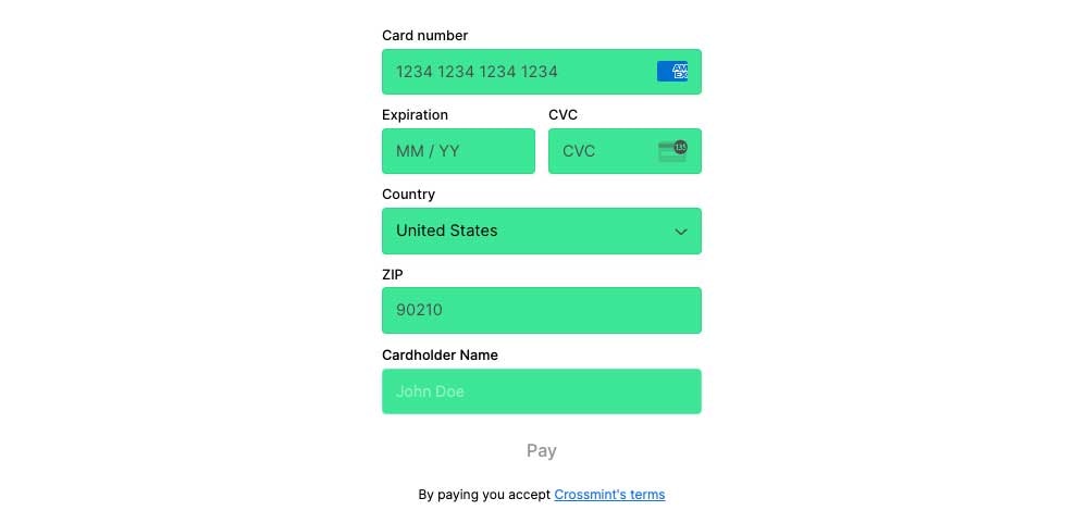
backgroundTertiary
backgroundTertiary
Sets the background color of the payment button.
Text Color
textPrimary
textPrimary
Sets the color of the text on the input labels, placeholders, and terms of service.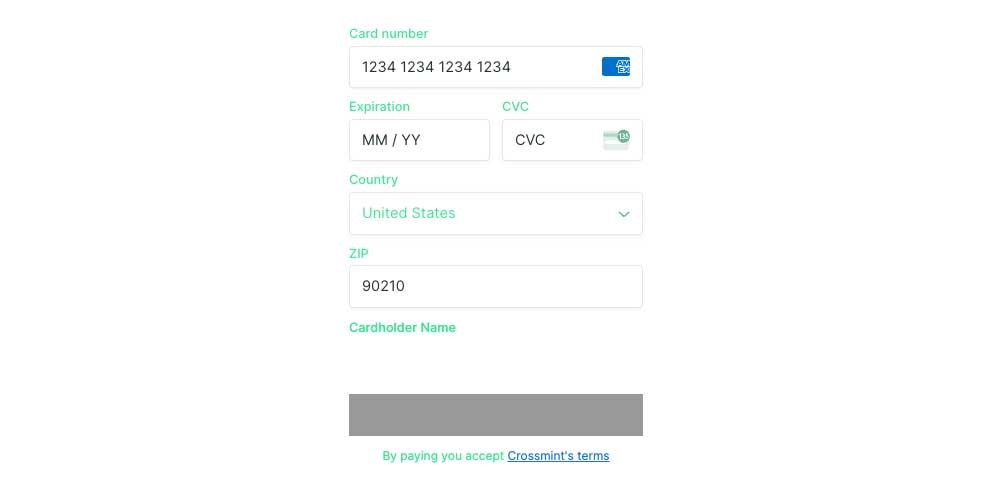
textSecondary
textSecondary
Sets the color of the text on the payment button.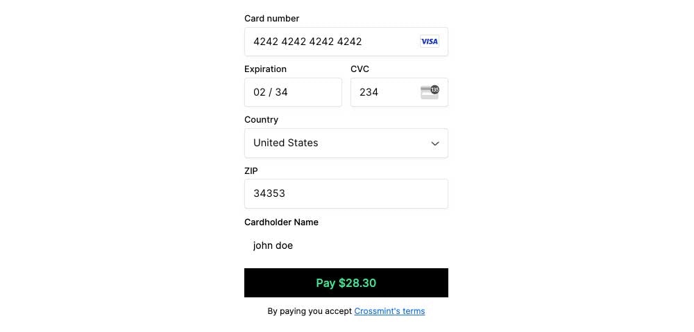
border
border
Sets the color of the input field borders when active.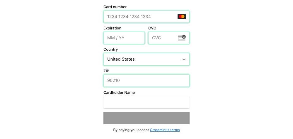
danger
danger
Sets the color of the input field borders and error messages that appear when there is an error.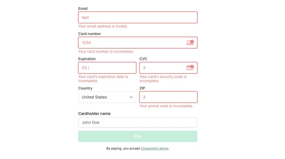
textLink
textLink
Sets the color of terms of service hyperlinked text.
Typography
fontSizeBase
fontSizeBase
Sets the font size for all text elements. The default value is 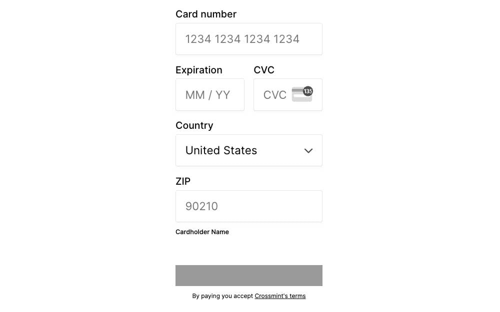
0.91rem.fontWeightPrimary
fontWeightPrimary
Sets the font weight of all the input placeholders.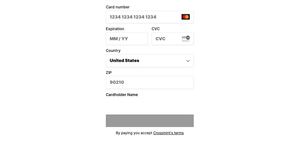
fontWeightSecondary
fontWeightSecondary
Sets the font weight of all input labels.